
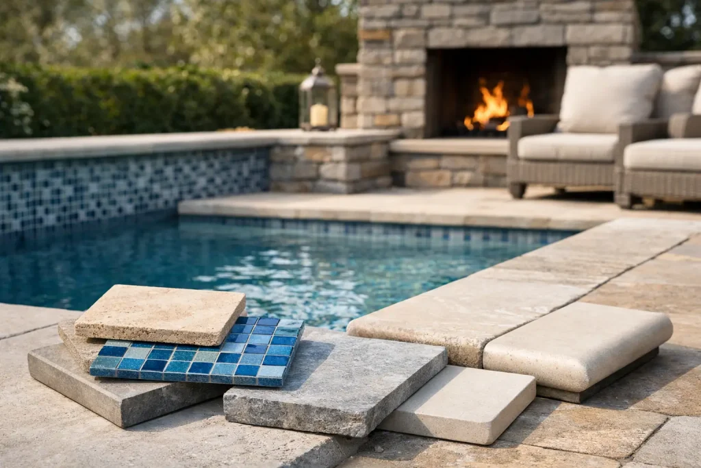
A pool rarely looks expensive by accident. The waterline may catch the eye first, but it is the relationship between pool tiles and coping that determines whether the whole space feels resolved or pieced together. Get that pairing right and the pool sits naturally within the architecture. Get it wrong and even a generous build can feel visually unsettled.
For design-led homes, this is not simply a finish selection. It is a decision about texture, temperature, maintenance and how the water meets the surrounding landscape. The best results come from treating the pool edge as part of a broader outdoor material palette, not as an isolated detail.
Why pool tiles and coping matter so much
Tiles and coping do different jobs, but they are read together. Pool tiles typically define the waterline, internal finish accents or feature walls. Coping forms the top edge of the pool, where swimmers sit, hands grip and paving transitions begin. One lives in constant contact with water, the other manages exposure, movement and daily use.
Because these materials meet at the most visible line of the pool, small choices are amplified. A coping profile that is too bulky can make a refined pool look heavy. A tile colour that fights with the paving can flatten the overall scheme. A beautiful stone that becomes uncomfortably hot in full sun may look right in a sample and feel wrong by December.
That is why specification should balance appearance with performance. Luxury outdoor spaces work best when they feel effortless to use.
Start with the architectural intent
Before looking at individual products, it helps to decide what the pool should contribute to the home. Some pools are designed as a calm extension of the architecture, with restrained tones and clean lines. Others are intended to stand apart as a focal point, using contrast, texture or richer colour to pull attention toward the water.
A contemporary home with crisp geometry often suits large-format coping, rectified edges and tiles in quiet mineral tones. A more organic landscape may call for natural stone with variation, softer edge treatments and finishes that sit comfortably alongside planting and timber. Coastal projects can move either way – some lean pale and understated, while others benefit from deeper blue or green tile notes that give the water more depth.
This is where many projects improve once the pool is considered alongside the rest of the exterior materials. Wall cladding, pavers, outdoor showers and even nearby fire features all influence how the pool edge should read. Cohesion matters more than matching everything exactly.
Selecting pool tiles with purpose
Pool tiles are often chosen for colour first, but surface, scale and reflectivity deserve just as much attention. The tile finish affects the water tone, and the water tone affects the entire outdoor mood.
Lighter tiles usually produce a fresher, brighter water colour and can make a smaller pool feel more open. Darker tones can create a dramatic, resort-like effect, though they may also show calcium build-up more readily depending on water chemistry. Textural variation and tonal movement tend to feel more sophisticated than flat, one-note finishes, particularly in natural settings.
For waterline tiles, durability and ease of cleaning are key. This band works hard and is constantly visible, so it needs to handle chemical exposure and mineral deposits without becoming a maintenance burden. Internal feature tiles, such as those used on steps, benches or spa spillways, should also be selected with slip and tactile comfort in mind.
Size matters too. Small-format mosaics contour beautifully around curves and are often ideal for shaped pools or detailed features. Larger formats can look quieter and more architectural, but they are less forgiving where radiuses or intricate transitions are involved. There is no universal best option – it depends on the pool form and the level of detail you want to express.
Choosing coping that looks good and performs
If tiles define the water, coping defines the edge. It needs to feel substantial without becoming visually dominant. In practical terms, it should be comfortable underfoot, offer good slip resistance and cope with weather exposure.
Natural stone remains a strong choice for premium projects because it brings texture and depth that manufactured finishes often struggle to replicate. Some stones stay cooler underfoot than others, which can be a major advantage in exposed Australian backyards. Finish is equally important. A honed or lightly textured surface can provide a refined look while still offering day-to-day practicality, but the right finish depends on the stone type and where the pool sits in sun and shade.
Profile selection changes the character of the pool more than many people expect. Square edge coping feels crisp and contemporary. Bullnose coping introduces softness and can suit more classic or family-oriented settings. Drop-edge coping can create a monolithic look, particularly on raised pools or where you want to conceal the pool shell and sharpen the visual line.
Thickness also plays a role. Heavier coping can look luxurious on a large pool, though on smaller projects it may overwhelm the scale. The best coping feels proportionate to both the pool and the house.
Pool tiles and coping should work as a pair
This is where good projects separate themselves from merely adequate ones. Pool tiles and coping do not need to match, but they should share a visual logic. That might be a common undertone, a similar level of tonal variation, or a balanced contrast between smooth and textured surfaces.
For example, a pale limestone coping with a soft grey-blue waterline tile can feel calm and architectural. A darker stone coping paired with green-toned mosaics may create more drama and richness. What tends to feel unresolved is when each finish is selected in isolation – one warm, one cool, one highly patterned, one flat – without considering how they meet at the water’s edge.
Samples are useful, but they are only the beginning. These materials should be viewed outdoors, in natural light, ideally beside your paving and façade finishes. Water, shadow and reflection change everything.
Practical trade-offs worth considering
The most successful specifications are honest about compromise. Some highly refined surfaces need more maintenance. Some pale stones show leaf tannins or outdoor debris more readily. Some darker pool interiors look striking, but can make imperfections or scale deposits more noticeable. Some coping materials stay cooler in summer, while others may deliver a look you prefer but need more thought in exposed areas.
Saltwater pools, surrounding trees, sunscreen use and the amount of direct sun all affect long-term performance. So does usage. A family pool with constant weekend traffic may need a different finish from a formal plunge pool designed primarily as a visual feature.
This is why product selection benefits from consultation rather than quick decisions made from images alone. Beautiful material choices hold up better when they are anchored to the realities of the site.
Planning the transition beyond the pool edge
Coping should never be considered without the adjoining paving. The edge detail is only one line in a larger composition, and the transition into terraces, garden paths and entertaining zones needs to feel deliberate.
A consistent stone palette can produce a calm, integrated result, especially in minimalist settings. Introducing contrast between coping and paving can also work well, provided the contrast is controlled. Too many competing tones or textures can make the outdoor area feel fragmented.
Drainage, expansion joints and falls also affect the final look. These are technical necessities, but when planned early they support a cleaner finish. Design quality often comes down to how well practical details are absorbed into the visual outcome.
When to keep it restrained and when to be bold
Not every pool needs a statement tile. In many high-end projects, restraint is the stronger move. A nuanced stone coping paired with a refined, low-contrast waterline tile can create a timeless result that lets architecture, landscape and water do the work.
That said, there are moments where a bolder choice is exactly right. A striking mosaic, deeper water tone or sculptural coping profile can elevate a courtyard pool or give a simpler landscape a stronger focal point. The key is confidence and consistency. Bold choices work best when the rest of the scheme supports them rather than competing for attention.
For homeowners and design professionals sourcing pool finishes across Brisbane, the Gold Coast, Sunshine Coast or Northern Rivers, climate and outdoor lifestyle are part of the brief. Materials need to look refined, but they also need to earn their place in real conditions.
A considered pool feels effortless because every visible surface has been chosen with intent. Pool tiles and coping are not the final decorative layer – they are part of the architecture of water. Choose them as carefully as you would a stone floor or fireplace surround, and the pool will reward you every day it is used, and every day it is simply seen.
The right combination should make the water feel settled, the edge feel inviting, and the whole outdoor space feel complete.